
New York Times VR Application Case Study
I am in no way associated with NYTVR. This is a personal project, and the opinions are my own.
This project has given me a chance to set deadlines for myself even if I think I should keep going. I have been able to explore new techniques and alternative options for my work. Personal design projects are a great reminder that that DESIGN IS AWESOME (even amidst the daily grind at work) and helps fosters my passions and excitement for XR and design.
Introduction
The New York Times VR app is home to a vast library of 360-degree storytelling experiences from award-winning journalists. The videos range from trips to outer space to historical commentaries to following refugees from the war-torn Middle East and many more. You can download the app on Google Play and the App Store as well as for the Samsung Gear VR.
Since the app itself launches in the Daydream or Oculus headsets, I will focus on the Android ecosystem although the IA would most definitely work cross-platform on iOS. Moreover, iOS users can still enjoy the videos albeit without a dedicated headset (Cardboard is always an option, but not the best viewing experience). I will be focusing on how the website IA needs to brought in for consideration in regards to how the VR mobile app organizes its content.
UX Methodolody

The high-level design process I follow is diagramed above. I have then broken out how I will structure this specific case study: User Research + Competitive Analysis, Task Modeling, IA, Sketching, Wireframing, Prototyping, User Testing, and Micro Interactions.
Problem Definition

Problem
I have observed that the NYT Mobile and VR applications are not meeting the users needs when it comes to information architecture and high priority user flows, which is causing friction when using the service. The app is not scalable in its current form, to continue to provide the user with a comfortable experience the IA must be adjusted.
Solution
I propose the cross-platform information architecture from the NY Time 360 website to be implemented into the mobile and VR app while focusing on the key user scenarios.
User Research & Competitive Analysis
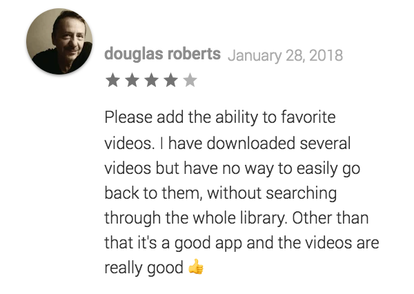
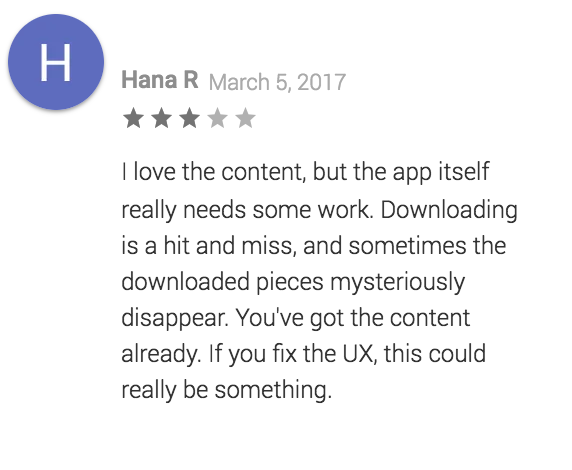
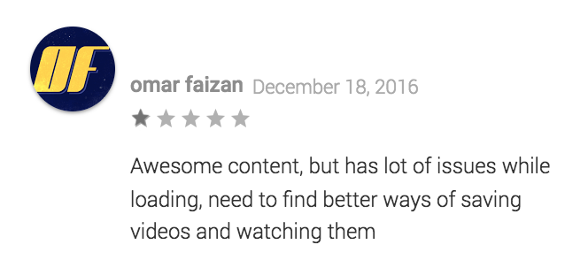
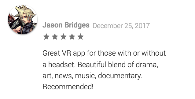
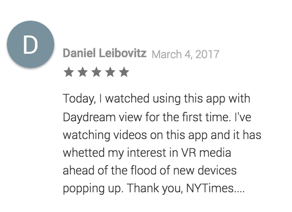
As a first step in the process of user research, I pulled together some of the reviews from the app store. I then went on to conduct my own user research and then cross-compared some of the reviews with my data. Additionally, a comparative analysis of the existing technology landscape was compiled to see how the NYTVR app leveled up.
The conclusion in both cases was the same- the content is impressive, but the organization of the mobile and VR app is horrible.

Website IA
The IA for the dedicated video site (left) clearly didn’t make it into the app. In particular, let’s take a look at “The Daily 360 Shows.” (https://www.nytimes.com/video/the-daily-360). The “Life on Mars” collection has 7 videos both in the mobile app and the website (https://www.nytimes.com/video/360-lifeonmars). But if we look at the other categories in the list we then see, “The Daily 360 Shows: U.S,” followed by World, Culture, Science, etc. which seems a drastic change from the narrowed down category of “Life on Mars.” It seems like the first couple collections may be featured items (see right), but it’s hard to follow what is the most important item here.
Suffice that to say the “U.S.” category (or collection) is not even in the mobile app and on the website it has over 90+ items in it (https://www.nytimes.com/video/360-World ).

https://www.nytimes.com/video

Android App
Mobile IA
On the same note, the mobile app is not even categorized the way the video site is. In fact, it is not categorized at all. The app offers a vast array of topics, but there was no easy way to find a specific video, and a search function is altogether omitted from the app.
If we look at the IA on the landing or home, we will see an infinite list to scroll (see right). There are about 49 top-level items. Some of that includes collections from the website like “Life on Mars.” However, there are only a few collections in the mobile app, 13 to be exact, and that is not sufficient organization. It is still too hard for a user to parse and find where that collection might be. One of the collections in the app is called, “The Daily 360” which has 329 items in it. Yes, 329, and the main list of items itself only contains 49. When a collection of items outweighs the main list it is time to reorganize and nail down the Information Architecture (IA). Again, with no categorization in the app, it is a mess trying to find things not only on a mobile interface but also in a VR headset.
Daydream IA
The VR app mimics the mobile app in that there is no categorization or search functionality. Not only that, but using the Daydream app to scroll from left to right is extremely frustrating.

Pulling it all together…
Section One
Section Two

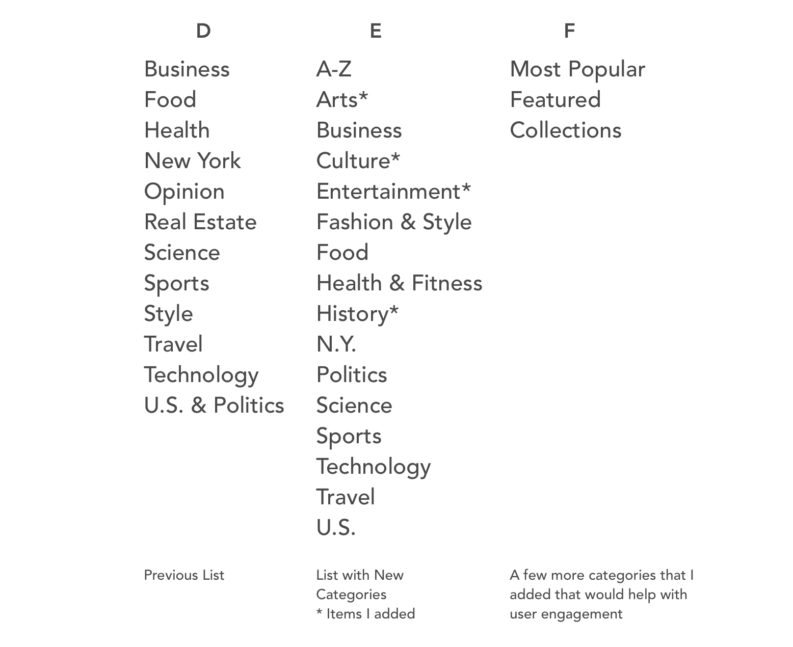
Since the mobile app has almost zero ways to navigate I began by I comparing the current menus from the NY Time Video site and their main site. Next, I took the categories that were the same from both lists and ended up with Column C. Column D is the same as Column C except in alphabetical order.
I did a short user test utilizing card sorting to see how each video would fit into the categories. There were visible holes, and I needed to add a few groups to fill in the gaps. Most of which I took from the original list and some I added myself. A few of the items I added myself was Entertainment and History. There were enough 360 videos in those categories that I felt rendered its own group. Many videos will span multiple categories, which in this case will benefit the user will finding content more accessible.
I did another short round of card shorting and this well a lot better than the previous card sort. Users were quickly able to find categories for about 95% of the videos, whereas the earlier categories yielded close to 79%. The other 21% were put into the "I do not know" category or I had the user create their own. With this improvement, I felt I was ready to move forward in the process.

Sketching
Sketches are an expression of thinking and problem-solving. My sketches are often in a constant state of flux. I use paper as a “brain-dump” to get all my thoughts out - good or bad. Once I need to communicate my idea to a broader team, I refine them as needed.

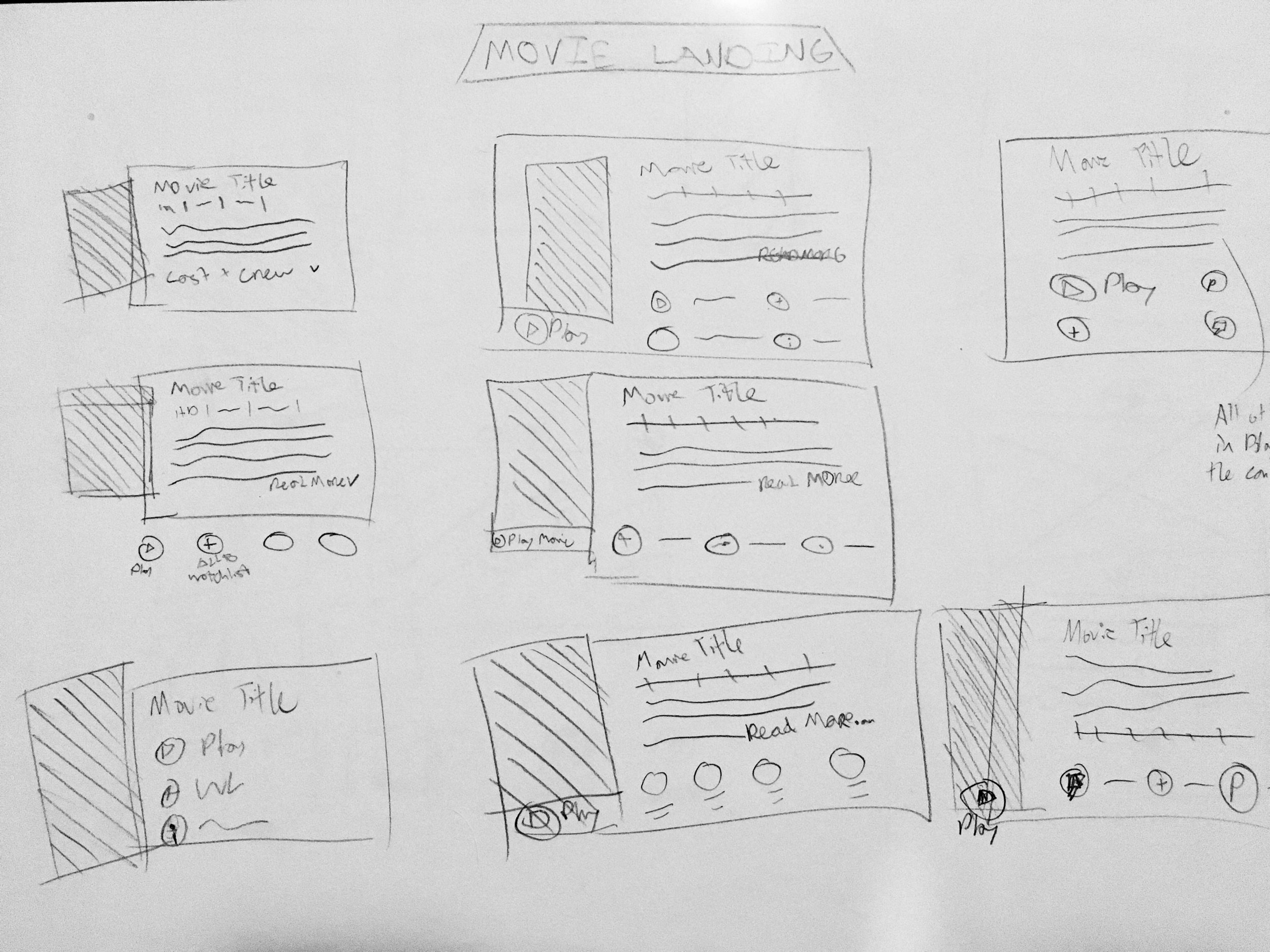
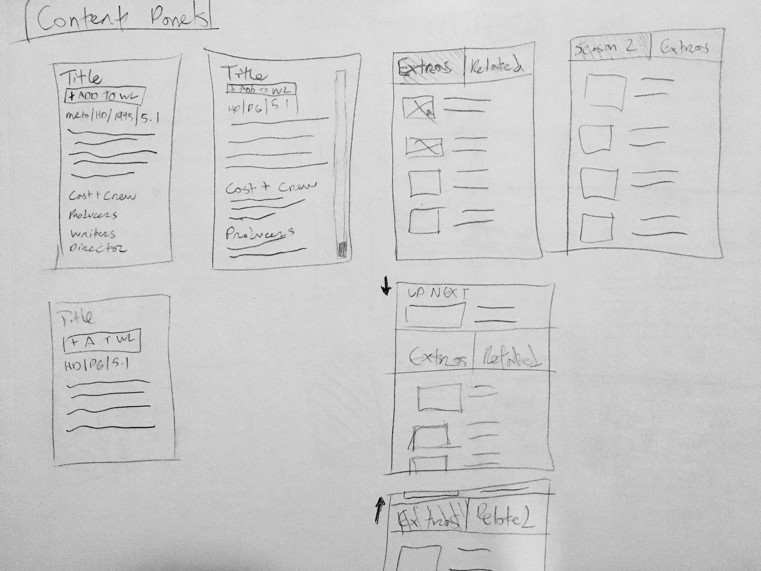

Layout explorations for the video assets

Layout explorations for the video assets
User Flows
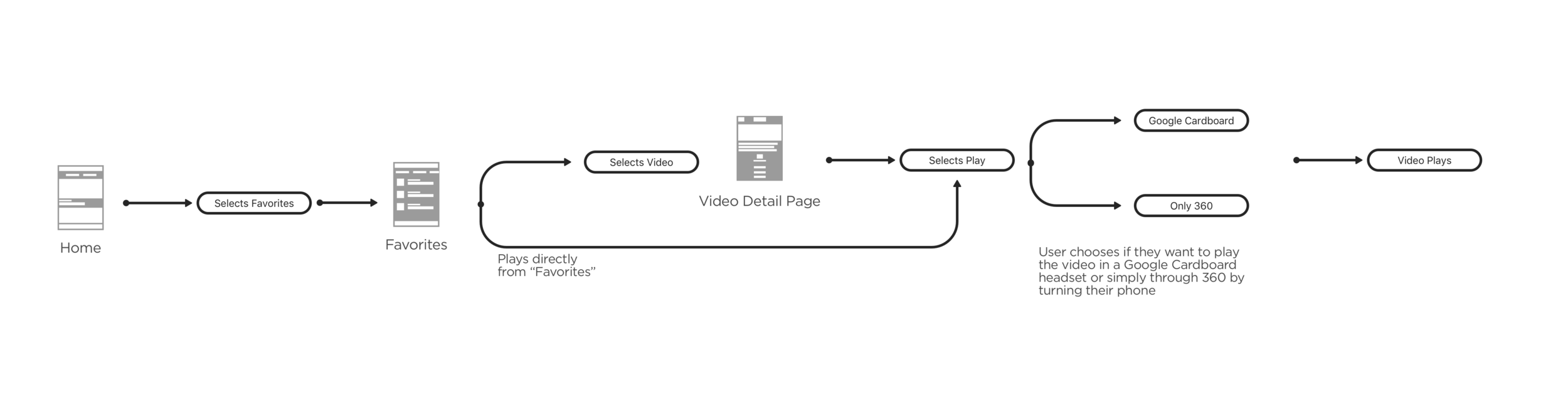
This flow explores how a user would play a video from their “Favorites” list on their Mobile phone

This flow explores how a user would play a video from their “Favorites” list in the VR headset
In Progress…
User Flows
Wireframing
Prototyping
User Testing
Micro Interactions